

ERROR: Content Element with uid "95814" and type "menu_30" has no rendering definition!
Disclaimer: Currently we (NDSU IT) don't have the staffing bandwidth to work with you for one-on-one home page consulting. The examples below were not from solicited work and are only examples (we didn't really update the sites). Also, we don't mean to pick on anyone so please don't take offense if "your" site is included in one of the following examples.
Example: move content around to fill out the home page
Sometimes as you create or update your department's Web site, you will be stumped for what should go on the home page. Too little content is bad, so how can you boost up the home page contents? Reorganize!
Before and after
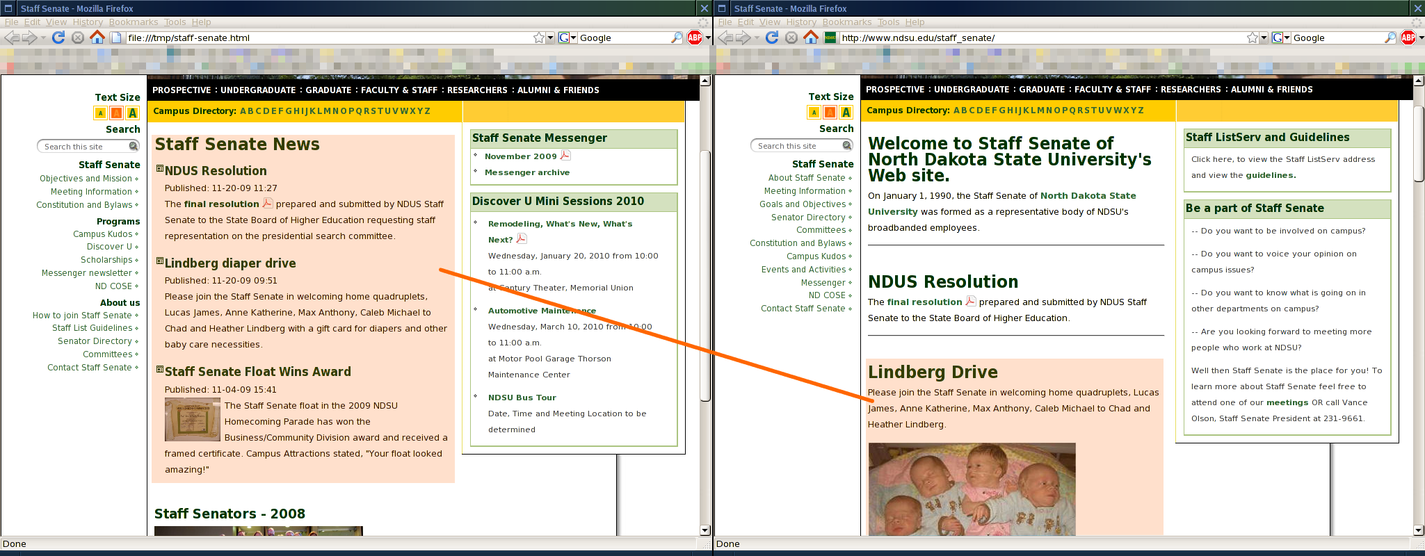
First, take a look at the before and after from our example case.
The before shows a page with a lot of white space, which can be good in some cases but here it is awkward. Especially since there must be something important to tell visitors!
The after shows a page with a balance of filler (an image) and white space and most importantly, information.

Re-consider navigation depth
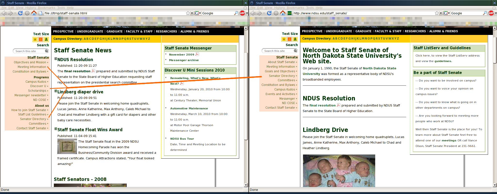
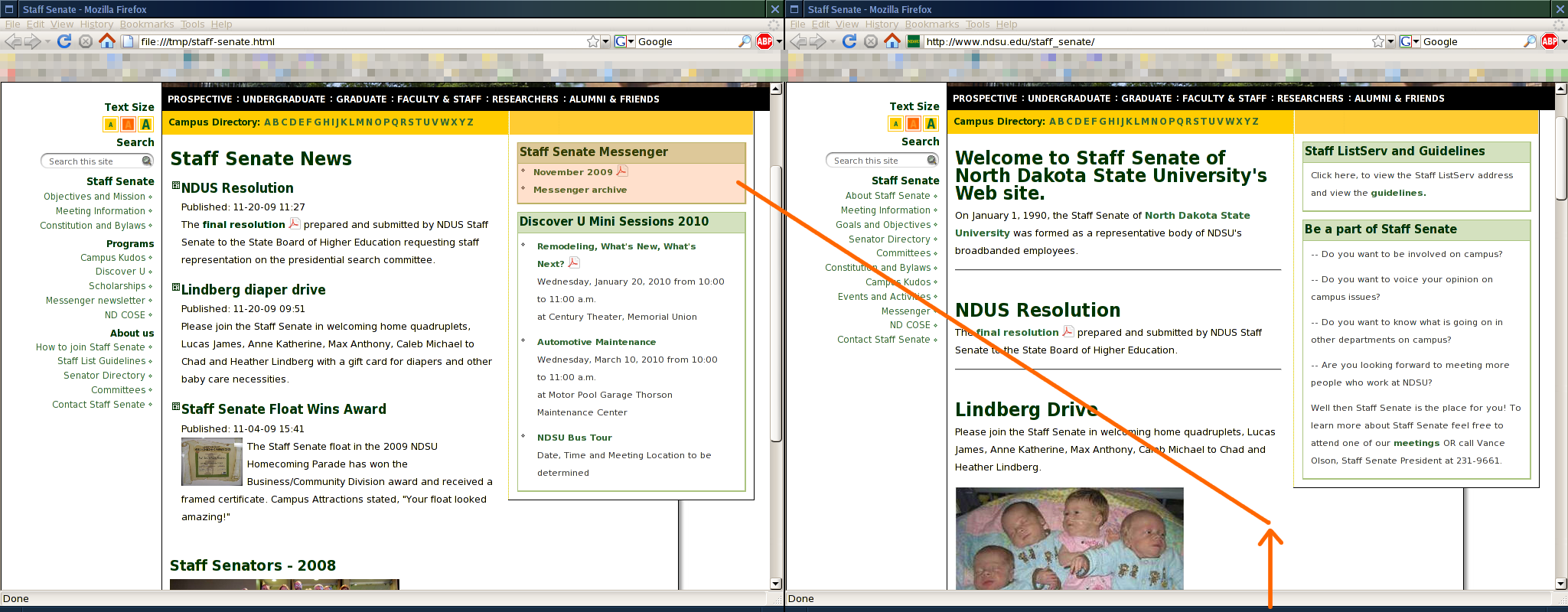
While it's possible to flatten a site too much and make the navigation too long, it is also possible to make it too deep. This means that visitors have to click on something to find out what is hidden beneath. Sometimes it makes sense to "raise up" pages more.
In the example below, the links under the Departments navigation item are duplicated on the home page, which indicates to me (Ms. Example Writer) that the departments must be pretty important. Important enough to be in the navigation menu, even. Putting the links at the top-level in the navigation menu also frees up space in the home page body to put real content--two birds with one stone!
What the examples show
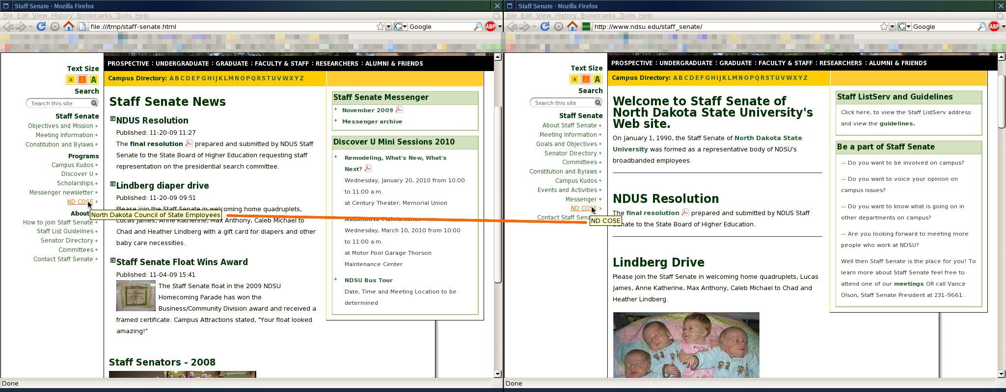
- Moving the links under the Departments navigation item (you can't see what's under there in the screen shot or while visiting the site!) to be top-level pages with a spacer called Departments.
- You can't see from the screen shots, but also suggested is to link directly to the related departments' Web pages. In general, you should support the Web by linking to the authority/single-source of information rather than re-creating the content yourself.
- Since the navigation links are visible on the home page, the Departments links aren't needed in the body area anymore, so they are deleted.

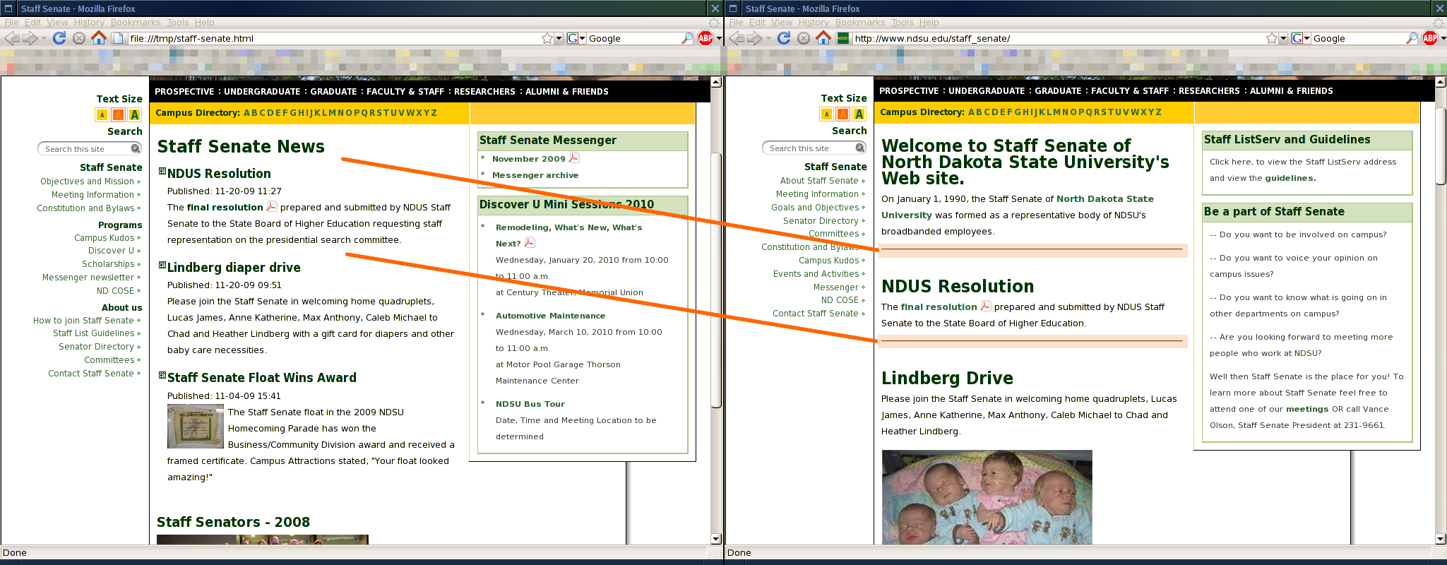
- Important things like "Signature Programs" (the name sounds important, anyhow) should be visible without hunt-and-pecking under curious labels like "welcome."
- Some buried pages in the example had very little content--a paragraph or two at most. And in this case, important things like "about" could be moved to the home page, especially since they're short. If the "about" content is long, you should include a summary and include a link to the full detail instead.

Identify similar navigation elements and group them together with labels to make the navigation easier to use and help visitors find the information they are looking for. If you have a lot of material to cover, this approach may result in navigation that is too long. If that happens, you could collapse down the less important branches of the navigation, or include links to the most critical parts in your home page directly.
Don't use too many filler images
Unless an images conveys information to a visitor (don't forget about image accessibility if it conveys information!) it is probable the image is filler. It brings "life" or "color" to the page and consumes a little bit of space.
Be careful not to use too much filler, especially on your home page. Web visitors don't have much patience, they just want their problem solved, so having to click too many times might lead them to give up on finding the message you want to convey. Also, with the prominence of portable devices (like Cellular phones) visitors have little patience for downloading useless filler images.
In the example, the image was down-sized to make room for information.

What will you do for me?
"Call me now! 555-1234!"
Wait, what? Who? Why? What will you do for me if I call you now?
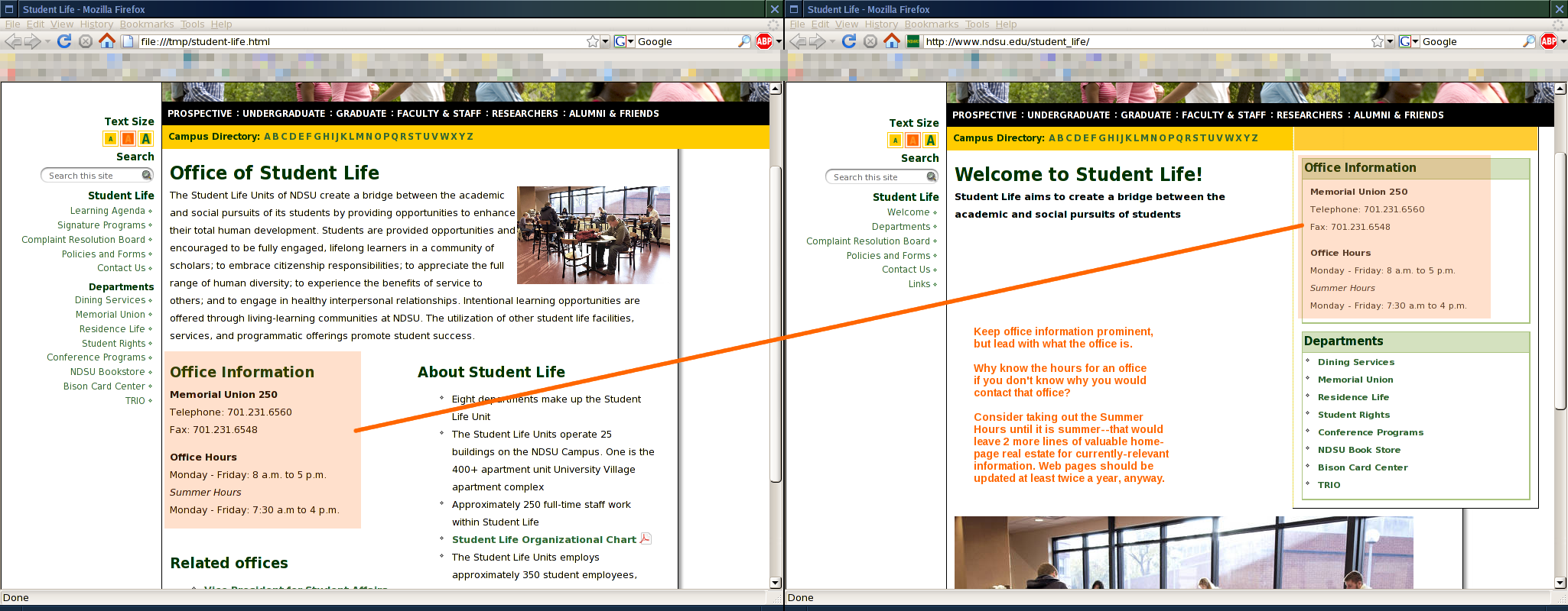
Don't forget to tell visitors who you are and what you will do for them. How to contact you is important (so important, in fact, that it's required to be in your site footers) but don't expect people to contact you just because they see your phone number or office location online. They need to know a context of when or why they would contact you.
Be sure to indicate how you can benefit or help the visitor. Don't try to get them to call you to find out what you can do.
Also, since you should be updating the site at least twice a year, conserve precious space by omitting duplicate information. Instead of listing your office hours for the entire year, list out the relevant hours. During the school year, list the primary hours. As summer approaches, switch the hours to indicate the summer hours (label them as summer hours in that case). Give full detail on your contact page instead.
Be clear
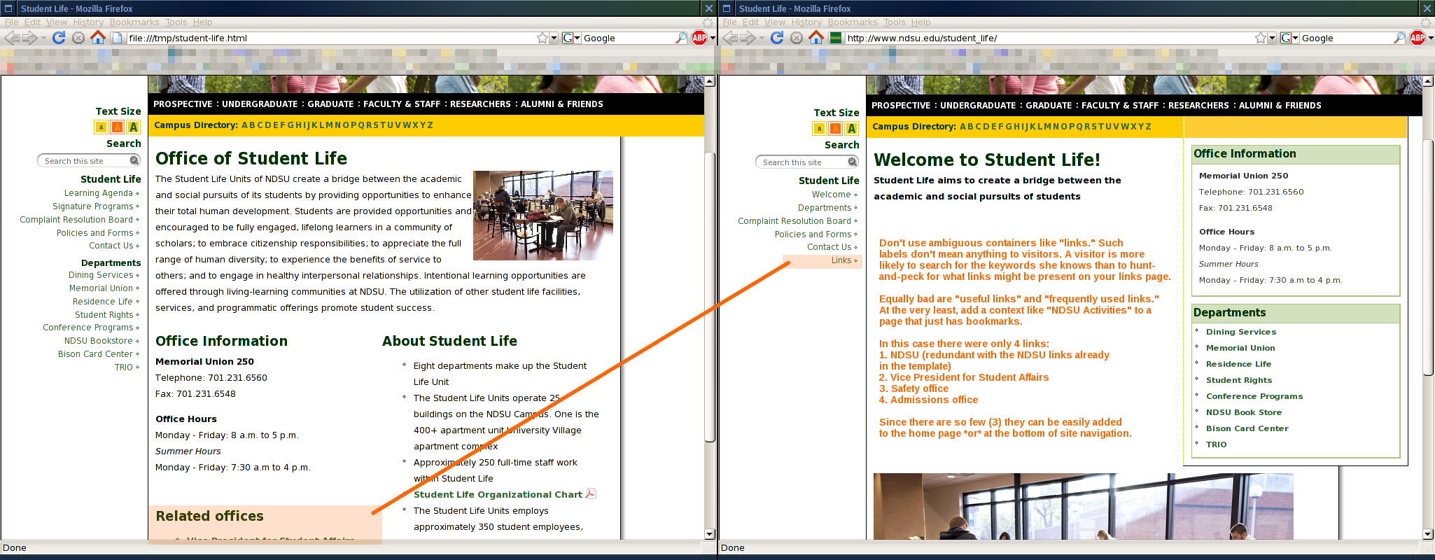
Supporting "the Web" by including links to related departments is encouraged (your division/college may even have requirements for you to link to the parent entity) but please don't bury these links under a page or heading called "links."
Instead, if you have a significant quantity of links to present, give the heading more context. For example, use a heading of NDSU Activities if including a link list of places to learn about activities at NDSU.
For our example, there were only 4 links on the "links" page:
- NDSU (which is redundant with the NDSU links already in the page template)
- Vice President for Student Affairs
- Safety office
- Admissions office
In the end, there are only 3 links, so they can be easily added to the home page. Alternatively, they could be added at the bottom of site navigation--again, with a meaningful heading.
Example: move content around to reduce the home page
If your page requires scrolling down more than 2-3 times to see all of the content, a regular content page should include a page index (like a table of contents). This would be a little tacky on your home page, though. And since your home page is valuable real estate, it probably makes more sense to abbreviate content (not words) on the home page and include links to get the complete stories.
Putting entire stories on the home page makes the page hard to scan and can frustrate visitors when they can't find information quickly. Flanders states that "it's difficult [...] to find the focal point. People get confused and they leave."
Abbreviate and link to the rest
On your home page, give critical details such as title, date/time and location for events and then include a link for visitors to get the full story.
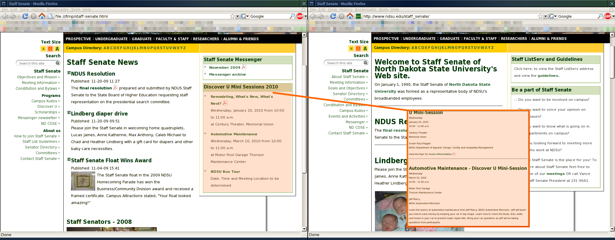
Automate abbreviation + link using news
If you don't want to manually maintain a list of the most recent 5 stories, use the news application to automate the process.
Keep updated content near the top
You should consider keeping updated content near the top of the page. Allow contents that change infrequently to be at the bottom so current content is easily discoverable by visitors.
The "Abbreviate and link to the rest" example uses the same technique to keep the events visible at the top of the page.
Don't abbreviate words
While you should abbreviate contents on your home page (where it makes sense), you should not abbreviate words. Visitors may not be familiar with the abbreviations you choose.
International visitors, in particular, may not be familiar with the abbreviations you use if you choose to abbreviate a word unless it is a standard abbreviation that can be identified from a dictionary.
There should not be a page in your site that contains something like "Prof prog reqs." Just spell it out: "Professional program requirements." Hopefully you didn't think that meant Professor program requirements, right?
Since the spelled-out version of some texts might not fit in navigation, you should use URL-setting abilities of CMS to make the navigation text short while keeping the title text long.
Content should divide itself
If you need a horizontal rule to communicate to visitors that a change of subject is about to happen, you should re-organize.
Sometimes you should reorganize by breaking the content into separate pages. Other times, the page just needs better organization within itself. The content can be organized into categories.
In the example, instead of unrelated headings, gather information related to news under one heading (news). Gather information related to events under a heading identifying the sub-parts as events.
Horizontal rules are a Web page faux pas. While you might intend them to add space between the two topics, the line actually visually draws the content closer together. Headings already create a generous amount of white space separation.
In another example, look at how busy the page is in the before, with several horizontal rules, versus how easy it is to read the information in the after. At a glance, the page is more friendly to visitors.

Use footers thoughtfully
The template footers are the one way that you have the control to put something on each and every page within the CMS site you maintain.
If there is some kind of terse message that, by division or department convention, needs to be on every page in your site, it makes good sense to include that message in the site footers. The example below demonstrates moving the department tag line and the bias report link into the site footers.
Not only does this technique reduce the need for you to insert this in every page, but it provides a visual distinction between the unique and non-unique content in the page.
Note: don't let your site footers get too bloated. Remember that less is more. Visitors don't need to read your entire dissertation on every page they visit. Knowing the title (include a link) is sufficient.

Don't center-align or bold too much
Center-aligning all the content of a page makes it extremely difficult to read. The visitor's eye can't come back to the same starting position for each line, making reading tiring and slow. Just don't do it.
Instead, leave the default justification (left) unless there is a compelling reason to do otherwise.
Another thing that doesn't help your effort is to bold too much on a page. Generally, bold text is harder to read than non-bold text, which means that you're possibly giving visitors a bad experience by over-bolding the page. Further, the intention of bringing emphasis to a part of the page is not satisfied because it is not emphasized any more than any other part of the page. Again, just don't do it.
Instead, use headings to properly outline the page, and use bullet lists to put collections of ideas into order. The paragraph styles have also been provided to help you bring special attention to key notices within a page.
