

Hero banner
The Hero Banner content element is generally located at the top of a page, although it may be used further down the page to emphasize key calls to action (CTAs). It should be used sparingly, as in web design "If everything is important, then nothing is." This quote is attributable (albeit in a different context) to Patrick M. Lencioni. Learn more about CTAs for Higher Ed websites.
To add a Hero Banner content element,
- Click +Content to add a new content element in the intended position
- Choose Special elements > Hero Banner
- Optionally specify a Headline, which will be used as a heading level 3 (<h3>) in the page.
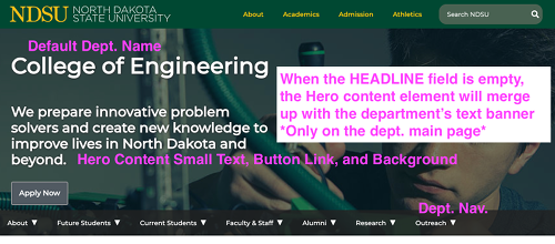 If the Headline is empty for a Hero Banner in the HERO content template position on the department's main page it will automatically merge with the department navigation menu (an example of this can be seen on the COE main page)
- You should not duplicate the department name as the Headline
- In any page you should not repeat the Headline in a subsequent displayed heading (doing so creates an awkward document outline that may make the page harder to understand, particularly for visitors using assistive technologies)
- Optionally specify a Short Text, which will display below the Headline
- Optionally insert a link, which if present, will render a link-button
- Specify a Link location where the link-button should direct
- Specify a Link text (call to action), which is the text that will display in the link-button
- Specify a Link color, which is the color link-button that will display
- Click Add image to add a Background image for the Hero Banner.
A good image is not very "busy" and has relatively little contrast in color throughout the image in order for the superimposed Headline and/or Short Text to be readable. The selected image never contains any text intended for the visitor to read. Inserting an image with text here is not accessible! Inadvertent text, such as a building sign behind the focus of a photograph, not intended for the visitor to read is acceptable - Check By checking, I certify that the provided background image contains no text if, in fact, the selected image contains no text
- Select a Background image height for the image
- Select a Text container size for the text (size being the relative width of the text display)
- Select a Text horizontal position for the text, noting that the text will still move to the left on smaller screens (in other words, if your image has a clear focal point, you should test to be sure the text is still meaningful and the overall appearance still acceptable on various screen sizes)
- Select a Text background shading color. This defaults to Black, but you can select None if the background image alone creates enough contrast for the superimposed text to be easily readable in "any" screen size
- Save and publish as usual
Note: only a Hero Banner inserted in the HERO column on the 2-Level Horizontal Navigation Bar + HERO layout will fill the full screen width, overflowing the text container area. Hero Banner content elements inserted in the Normal column will always be constrained by the text container.
Selecting an effective Hero Banner image
- An effective Hero Banner image should be impactful and visually stimulating and should be high-quality (not low-resolution or pixelated). Stock photography can make the message look artificial, which could result in visitors ignoring the Hero Banner content, so choose wisely and test with prospective visitors to validate your message and image are effective together. The Boag World UX company authored this blog post offering helpful insights on how images can draw visitors in or distract them from the CTA.
- The Hero Banner should use a single image, not a collage. Do not add borders.
- Photographs may benefit from postprocessing using a photo editor. For example, you might apply blur filters to shift focus toward certain components of the photo, to minimize or hide distracting parts of the photo, or to adjust color properties to make the overlaid text more readable.
- The image must not contain any informational text intended to be read by the visitor. Do not use a photo editor to add text to the image or use a screen shot of text as part of the image. Doing so will cause an accessibility violation.
- Do not choose any animated graphic (doing so will cause an accessibility violation because there is no way for the visitor to stop the animation).
- Depending on the size of their screen, the visitor may not see all parts of the image, so you should design the image to look appropriate even when the margins are not visible. Testing is advised to be sure heads aren't chopped off, for example. Compare the example Hero Banner that follows and its appearance at different screen sizes to the full background image used.
- Be sure you have distribution rights to the image! Just because you "found it on the Internet" or "found using Google Image Search" does not mean the university is authorized to redistribute the image. Do not use Bison Athletics logo marks without authorization of Bison Athletics.