

2016 Projects
Architecture Technology Corporation
Network Visualizer
Project Details
ATC has been developing CyVis, a network visualizer for dynamic tactical networks. CyVis uses data collected from ATC’s CyDANT Routers and uses it to displays nodes, links, subnets, and traffic graphs over a GeoLocation moving map display.
Since the monitoring for this system is tied to data from their own routers, ATC turned to NDSU’s senior capstone students to develop a way to accomplish the same visualization with any commercial off the shelf non-ATC router.
Adventium
Architecture Model Experiment Orchestrator
Project Details
The Architecture Model Experiment Orchestrator, or AMEO for short is a tool for use alongside Adventium Labs’ AADL Modeling suite for testing satellite design options. If fed an input file, it gives the user the power to pick which parts of the input file to generate tests over, and features 3 different modes: Exhaustive Combinations, Pair-wise Combinations, and Random Iterations. The output of the program consists of a text file that contains all the values of the parameters to be used in the test.
Bolder Thinking
Project Details
Our Bolder Thinking web interface was an improvement over Capstone 2014's project that utilized the command line interface. This software was intended to make demoing the load test easier for Bolder Thinking instead of having to type commands in the terminal. This functionality is all streamlined in the front end web interface. Everything will be explained in the video.
Capturis
Project Details
Our PDF Conversion Application is used to gather data from a PDF based upon user-provided Field names and selected areas (on the PDF). The template created for a Customer/Vendor combo is saved in a local DB along with the Field names and datapoints (X,Y, height and width). The information is gathered from the data points and saved to a CSV file.
Data61
Itenerary Visulization on Australia's National Map
Project Details
The National Map is a project developed by National Information Communication Technology of Australia (NICTA). Data61, the largest data innovation group in Australia, was formed by merging NICTA and CSIRO. National Map takes data from data.gov.au, an Australian government website, and visualizes it on the map. As of now, National Map does not allow users to create and view routes.
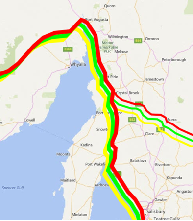
Our task was to make an application for tourists to plan trips. We chose to visualize multiple routes on the map so tourists could decide which route from a point A to a point B suited them best. We decided upon different criteria to rate the routes. These criteria include time, distance, and beauty. Each quality criteria are to be visualized on the map in a different way. The user could then decide which route suited them best. We also connected data on points of interest from multiple sources. We pulled pictures from Flickr that would highlight attractions along each route. This will help a user decide which route they found more interesting.
We were able to accomplish most of the tasks we set out to accomplish from the beginning. We were able to pull in data from Flickr and view it on the map as points. We were also able to rate each route based upon the distance. We decided to visualize them with different color lines and different weights for the ranking. The thicker the line, the better that route is for that attribute.
Below is a screenshot of the lines with different weights and colors. You can see the higher route has thinner lines and the lower route has thicker lines. This is one way you can visualize the difference between the two routes. Of course, there are many other possibilities for visualization.
We really enjoyed working with an international company and gained some valuable experience. This Capstone project provided us with many opportunities we would have otherwise not had access to. We hope Data61 can improve upon our visualization techniques and eventually use our ideas in Australia's National Map.
Team: Rachelle Clayton, Jordan Christiansen, Joseph Osborne, and Sean Warne
FBS
Project Details
Real Estate mobile browser app that allows interested buyers get in contact with Real Estate Agents right away.
Team: Alejandro Garcia, Nick Heilman, and Nick Minar
Fjorge
Grand Central Database
Project Details
For our project, we aimed to automate the project management process ofminneapolis-based web development company fjorge, which was completely manual. We did this by syncing the data between their five different software applications, using the APIs provided by the systems. By doing this project, we were able to minimize the chance of human error, as well as save fjorge time, by passing data between the systems. The video will describe the different systems we worked with, what they were used for, and how our project interacts with those systems.
IBM
Kubernetes
Project Details
In cloud environments, cluster managers like Kubernetes, Docker Swarm, Apache Mesos, and others are getting a lot of attention. These technologies are designed to manage application deployment in large scale environments using container technologies such as LXC and Docker. With deployments reaching hundreds/thousands of containers, features like auto-scaling, data replication, and data persistence simplify managing at scale. With so many options available, how does an honest, hardworking app developer decide what to use?
In our project we were tasked with deploying a Kubernetes cluster and validate key cluster management features. We also developed an Ansible playbook to automatically deploy our cluster into a cloud environment.This was all done to report back to IBM about our experience with the Kubernetes cluster manager as new users.
Team: Heather Malmskog, Carlin Mische, Michel Thomas, and Franklin Slaby
Integrity
Skynet Project
Project Details
Our project is a SCADA front end user interface with a database backend. The user interface is for a variety of users from programmers, managers to workers on the assembly line. The database keeps track of multiple types of data such as machines, vendors, departments and facilities. All this data can be easily accessed through the user interface. It allows users to access, add, edit and delete data (with proper authorization). Features like help buttons and tutorials are included to assist casual users. A tree structure was used in the user interface to make accessing the data more manageable. A search feature was also created with scripts to allow users to search for particular data pieces.
Team: Everett Kuntz, Erik LaVanier, Brandon Grindall, and Chengyao Tang
Inwerken
Banana Trifle
Project Details
As the world continues to become more and more interconnected, it is important that business be able to harness more of its data. Our team is working with Inwerken, an SAP business software consulting company to make an Internet of Things (IoT) solution to easily obtain and display sensor data in the cloud.
Our solution for this is to use a TI-SensorTag CC2650 sensor to capture data and send it to a BananaPro microcomputer via Blusnoetooth Low Energy (BLE). The data is then preprocessed on the BananaPro device locally, then pushed to the SAP HANA Cloud via the internet with simple URL calls. Using SAP’s UI5 platform, we have implemented a display dashboard to visualize the data, giving the client greater control and awareness over their product and processes.
John Deere
Project Details
John Deere Electronic Solutions (JDES), formerly Phoenix International, requested our group research and explore the concept of Predictive Analytics and deliver a report on the topic at the conclusion. The goal of this project was to see if Predictive Analytics would be useful for their company. With this goal in mind, the capstone group members and project mentors researched potential software suites, secured and examined data from JDES, cleaned the data for analysis, and performed analysis on the data to try and identify a pattern in warranty claims starting from initial manufacturing data. We used the R language – a free, open-source statistical language – and the RStudio development environment.
Linkoping
Swedish Meteorological and Hydrological Institute/Linkoping University
Project Details
The project was a web application used to monitor climate data coming from an HPC. We used a php back end with an Angular JS front end. The information displayed includes time stamps of previous 5 updates, time since previous updates (displayed as a dynamic counter), most recent model status (including previous 4 status), and a time series charts to display scalar data. Another feature includes the ability to search and display multiple files. Our project is compatible with a variety of devices including tablet and mobile.
Team: James Henderson, Jon Walker, Adam Boole, and Michael Schumacher
Microsoft
Employee Self Service App
Project Details
We were building an app for Microsoft with the main purpose of giving them feedback on developing with Xamarin for Dynamics AX. To do this we were building a cross-platform app for an employee self service system. The main features we wanted to implement for this were a profile page where you could view and edit your personal skills and certificates, a jobs listing page where you could view and apply for open positions, and an employee directory page where you can view and search for coworkers.
Team: Erik Canton, Jordan Kurtz, Jordan Pansch, and Amber Willenburg
NDSU IT Department
Web and Directory Search
Project Details
Our project consisted of improving the NDSU search page. The current search implementation uses Apache Droids and Apache SOLR to search the NDSU website. Additionally, there is a SOLR directory with which you can search for students, staff, or faculty and find emails, phone numbers, and other information. The goals we were given were to move the search to use Google Custom Search Engine, merge the web search and the directory search, add another searchable SOLR core with other searchable content (building search), and update the UI on both desktop and mobile. We accomplished these goals by implementing an Angular.js framework that would send the search query to both the Google CSE and the SOLR directory asynchronously. The results page was formatted to have the CSE search results on the left side of the page and the SOLR directory results consisting of close matches on the right side. Any directory results that were considered to be an exact match were displayed directly underneath the search bar with more information than would be shown on the right side for a close match result. The search can also be done solely on the SOLR directory by clicking on the directory tab. Here, the user can see all the information on all close match results as well as filter by department and affiliation and sort the results. The search will not allow student to appear as results on a first name base only as per request by the sponsors. Students will only show up on an exact first and last name match.
Team: Deovandski Skibinski Junior, Marc Kostelecky, Alex Nilles, and Chris Hasse
Noridian
Project Details
Noridian currently has a problem where their Oracle and Active Directory accounts are getting out of sync. They would like to sync account passwords on these two systems together to help save time when passwords need to get reset. To solve this issue we integrated Oracle Internet Directory. Oracle Internet Directory acts as a middle man between the Oracle database and Active Directory. This software enables both of the systems to stay synced together whenever changes are made to user accounts.
Team: Josh Bartholomew, Amanda Christiansen, Kevin Gregoire, Aric MacDonald, and Sam Olsen
Rockwell Collins
Project DetailsRockwell Collins requested we create a c++ core library to convert raw networking log data into a human readable format. In addition we also created a GUI application to display and analyze the converted raw networking log data.
Upper Great Plains Transportation Institute
Curve Speed Warning System
Project Details
The Upper Great Plains Transportation Institute (UGPTI) is interested in experimenting with a new technology to help warn users about speed warnings when going around a curve. Currently, transportation agencies utilize fairly expensive signs at certain distances before curves to warn drivers. However, many of these signs are not dynamic, in that they cannot monitor the driver’s actual speed and warn them about slowing down, however, when dynamic speed warning systems are used, they have shown to be more effective at speed reductions than static warning signs. The goal of the Curve Speed Warning System is to emulate a dynamic warning sign using a smartphone application that can monitor users’ speeds and dynamically warn them if they are approaching the curve at a speed that is considered unsafe. This solution is extremely desirable for UGPTI as proof of concept to providing an affordable alternative that can be used by any driver and promote safer roads for everyone.
Project Video Vision
The instructional video that the UGPTI team plans to create is going to involve a real world application to show how the system can be utilized properly. At the start of the video, a video of the device’s screen running the application will be captured so a high level description of the screens that a user or driver will see can be given. After the introduction and overview are given, two recordings will be captured and displayed - one recording will capture the device’s screen during the demonstration and the other will capture the view from the vehicle itself. These two screens will be synced so the audience can see how the application reacts to the driving situations in real time. During this demonstration, more technical explanations will be given about how the application tracks your location and speed as well as detecting a curve that the driver is approaching. After a couple of demonstrations have been shown, instructions will be given on how to properly stop the application. A conclusion will also be given at this time to summarize some of the important aspects of the application.
Team: Alex Buchholz, Nick Ellingson, Brody Herrmann, and Surya Sharma
Valley Express
Email Signature Removal
Project Details
Valley express receives thousands of emails an hour more than what can be dealt with manually. So a system that automatically goes through and finds possible leads for truckers was created to help with this issues. Signatures provide a lot of noise data that sometimes causes problem from Valley Express’s system so we were tasked with coming up with a solution to this problem.